

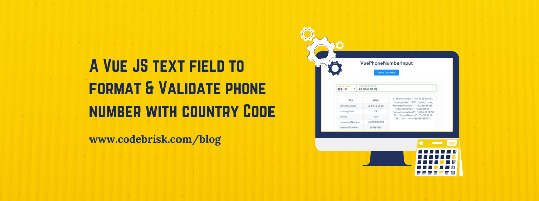
MazPhoneNumberInput is a standalone input component made with Vue Js which helps the user to enter a phone number and validate it according to the country. You can visit its demo here.
Features
It has many amazing features given below:
- You can set
preferred-countries,ignored-countriesor have only-countries - Validator State: input becomes green (you can modify this color with
valid-coloroption) when the phone number is valid (can be disabled byno-validator-stateattr) - Multi options to getting country code : By default the component get the country code via the browser (disable it with
no-use-browser-locale) or you can usefetch-countryto get the country code via https://ip2c.org/s (network needed) - you can usedefault-country-codeoption instead to set one - Phone number formatting while typing
- You can search your country in the list (open countries list & type your country name)
- Keyboard accessibility (Arrow down, Arrow up: Countries list navigation - Escape: Close countries list)
- Phone number example for each country in placeholder/label
- Auto focus phone number input after selecting a country
- You can disable the flags -
no-flagsprops - Set your translations
Installation
You can install this component via Npm or Yarn:
yarn
yarn add vue-phone-number-input
npm
npm i --save vue-phone-number-input
How to use it ?
ES6 Modules / CommonJS
import VuePhoneNumberInput from 'vue-phone-number-input';
import 'vue-phone-number-input/dist/vue-phone-number-input.css';

Vue.component('vue-phone-number-input', VuePhoneNumberInput);
<VuePhoneNumberInput v-model="yourValue" />
UMD
<VuePhoneNumberInput v-model="yourValue" />

<script src="https://unpkg.com/vue" charset="utf-8"></script>
<script src="./dist/vue-phone-number-input.umd.min.js" charset="utf-8"></script>
<link rel="stylesheet" type="text/css" href="./dist/vue-phone-number-input.css">

<script type="text/javascript">
  Vue.component('vue-phone-number-input', window.VuePhoneNumberInput.default);
</script>
Options
- Differents size of input (sm or lg)
size=“sm|lg” - Disabled option (
disabledprop) - Dark UI option (
darkprop) - Active a clear button by the prop
clearable(cf: VueInputUi options) - Active a loader progress bar by the prop
loader(cf: VueInputUi options) - And others
For more details & source code, you can visit the documentation on Github.

Written by
Rizwan Aslam
Founder and CEO of CodeBrisk, with years of experience building web applications with Laravel and leading a team of expert developers.
More about Rizwan